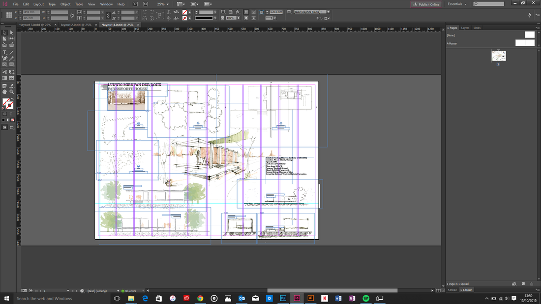
After completely changing the composition of the panel several times we have finished our panel.
Please download pdf file to view our panel.
Please download pdf file to view our panel.
| layout_5a.pdf |
|
After completely changing the composition of the panel several times we have finished our panel. Please download pdf file to view our panel.
1 Comment
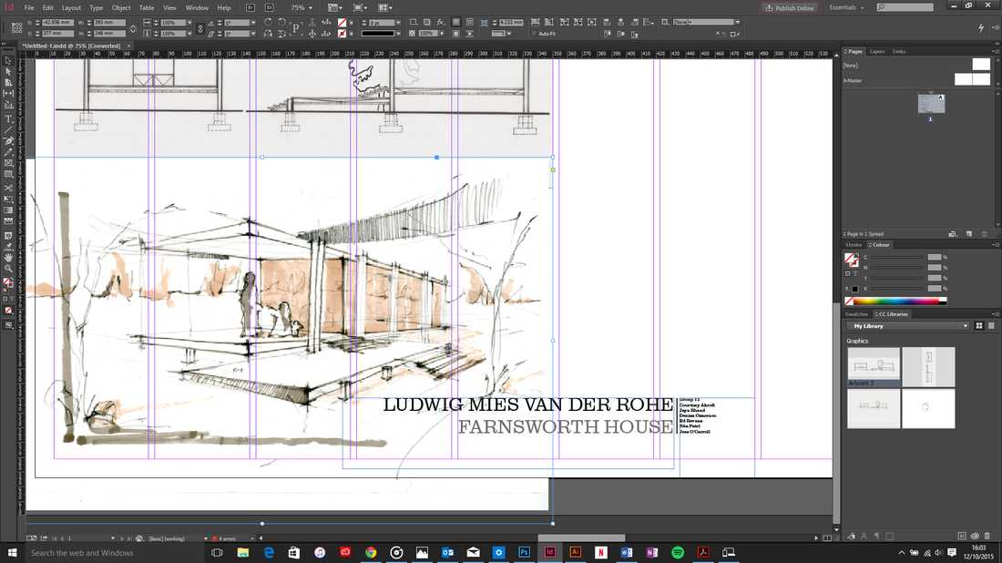
 Print screen of panel on InDesign, 2015 We are working together to complete the panel before the deadline; all that's left is to add the rest of the people and trees.
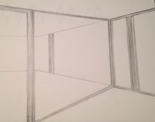
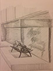
Here are a few interior drawings of Farnsworth House; this helped give more of an understanding of the spaced used inside the house.
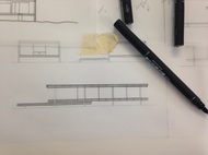
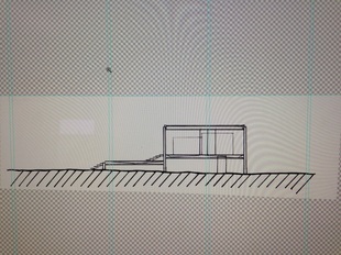
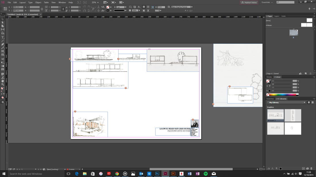
 In the pictures below shows my progression of my site sections I have completed drawing. The scale of my site sections are at 1:200. I first printed out the CAD drawings of Farnsworth House to the right scale and then traced out the site sections, horizontal and longitudinal. I did this by using an architectural ruler and different size pens to create different line weights for the orthographic drawing.
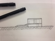
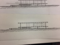
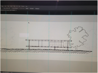
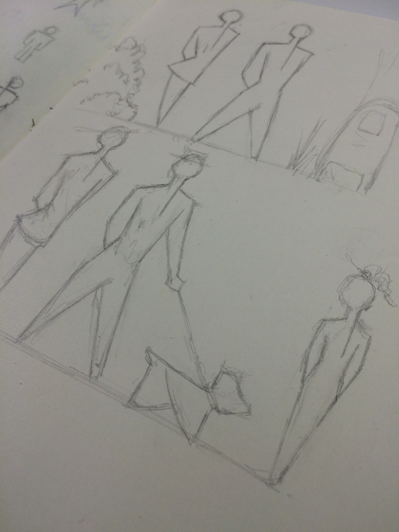
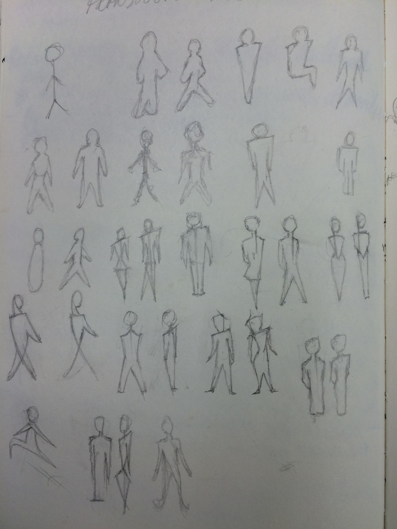
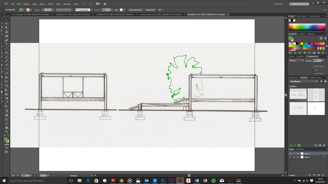
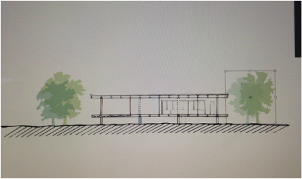
After many drawing errors, I was finally able to complete the site section drawings. I figured out exactly where the cut through the building would be, and drew up both the correct section and elevation CAD drawings, then used Photoshop and merged the different parts together. To show the buildings relationship to the site, I drew trees around the house and also drew up the correct ground line, it being slightly uneven as Farnsworth House was build in the woods. Site Section, Photograph taken by Sita Patel, 2015 I have design some people that can be used in our work. By adding people in our sketches it is a means of providing perspective of the building's size and showing it in a context of use.
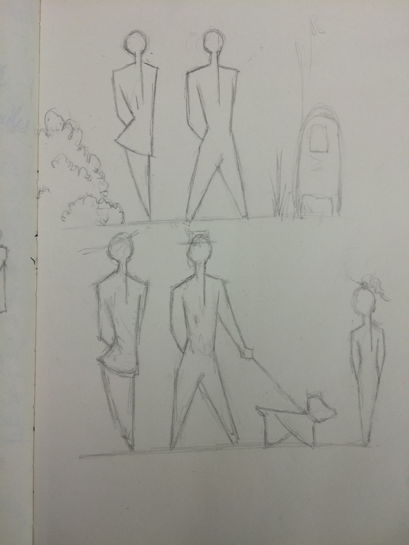 People Designs, drawn and photographed by Courtney Akrofi, 2015 As a group, we have taken inspiration from Mies van der Rohe; we have decided to approach the panel with the idea of less is more to create a simplistic but effective presentation.
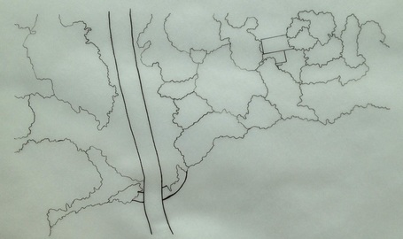
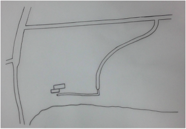
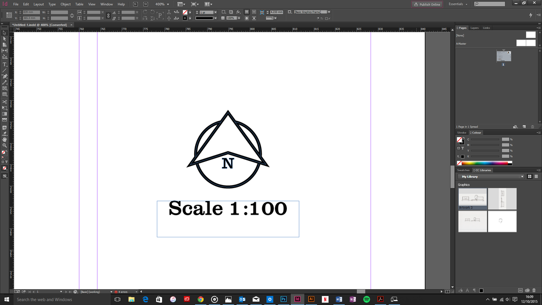
Using the house sketch as our focal point, we have decided to use the colours from there on the rest of the panel; this will ensure the panel is consistent. The main colours that will be used is beige and faded olive green. Using Google Maps, I drew some contextual site plans to accompany my original site plan. Sketch one illustrates where Fox River Drive, Fox River and the trees are located. Sketch two is a clearer drawing of where the roads and river is and how people can access Farnsworth House. The next step is to use Photoshop to add colour to both representations. Both drawings are not to scale.
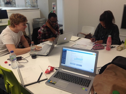
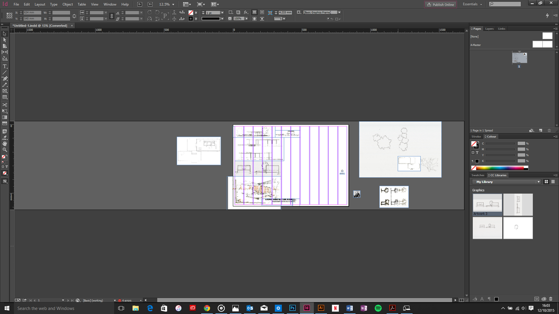
Using InDesign, we have begun composing the panel for the final review. We have took on board all of the critiques from the Tuesday session, and have now started editing. Today we pinned up a draft of our panel for piers and tutors to critique. We received useful comments to help us develop the panel and improve our presentation. 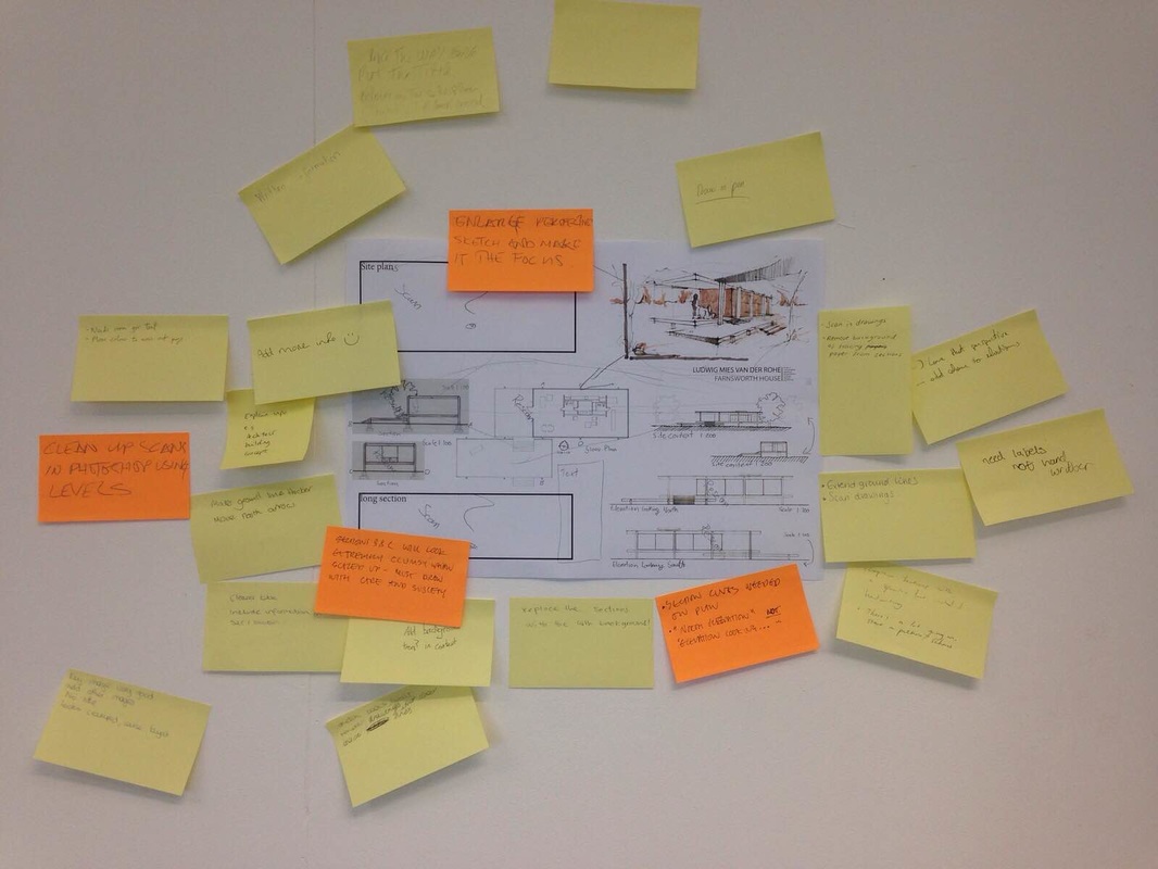 Panel Pin Up, Photograph by Sita Patel, 2015 |
||||||||||||||||